Whitefish Ski Resort

Background
My project is focused on redesigning the IA (Information Architecture) and website for the Whitefish Mountain Resort. Whitefish Mountain Resort is a ski resort in Montana that I actually visited in April 2021 for my first ski trip.
While I was reviewing their website, I noticed that they had a lot to offer visitors, but lacked an organizational structure for all their content. Their main menu is packed with information but the navigation labels were vague and finding the right information was difficult for me. So I felt this was a good project to see if I could make the website more user-friendly and allow users to efficiently find the right information or complete a task.
Process and method
Content inventory: To access the current site and find opportunities to remove or revise certain pages.
Card sorting: help determine and test which Organizational Schemes should use
IA Testing: Treejack tool to test the sitemap, to see how users explore the site as in real world scenario
Click testing: Chalkmark tool to collect user’s first impression data on my redesign wireframe of the webpage, to see where they would go to invoke the task and to test if a feature I add makes sense.
I used the tool Optimal Workshop to conduct all tests.
Persona
I created two main personas that would use the ski resort website.
The first persona is a first time visitor named Sean. He is mainly looking for information like lift ticket prices, ski equipment rentals, and general information about the ski resort, such as trail maps, snow report, and directions to get there.
The second persona is a return visitor named Miranda, who goes skiing multiple times in a season. She focuses on information such as season passes, terrain park maps (challenging trail routes where she can perform tricks), and competitive programs.

Content Inventory
First, I conducted the content inventory of the website and I found that there were too many second and third level navigation items, 100 items in total, which made it inefficient when users are looking for information they need.
For example, there were two secondary navigation labels called “Strider Bike Park” and “Spider Monkey Mountain”, which were kid-only activities but you can’t tell just by reading the label. Those two items could have been nested under one page labeled “Kids Center”. Conducting content inventory helped me do an initial re-organization and allowed me to simplify the navigation by combining labels.

Card sorting

Round 1 Card sort Results
6 Participants, 29 cards, 5 categories
The first card sort I have 29 cards, 5 categories, and I tested 6 participants. The goal for the first card sort was to determine if the current main navigation items made sense and to see if users could relate the cards to the main navigation.
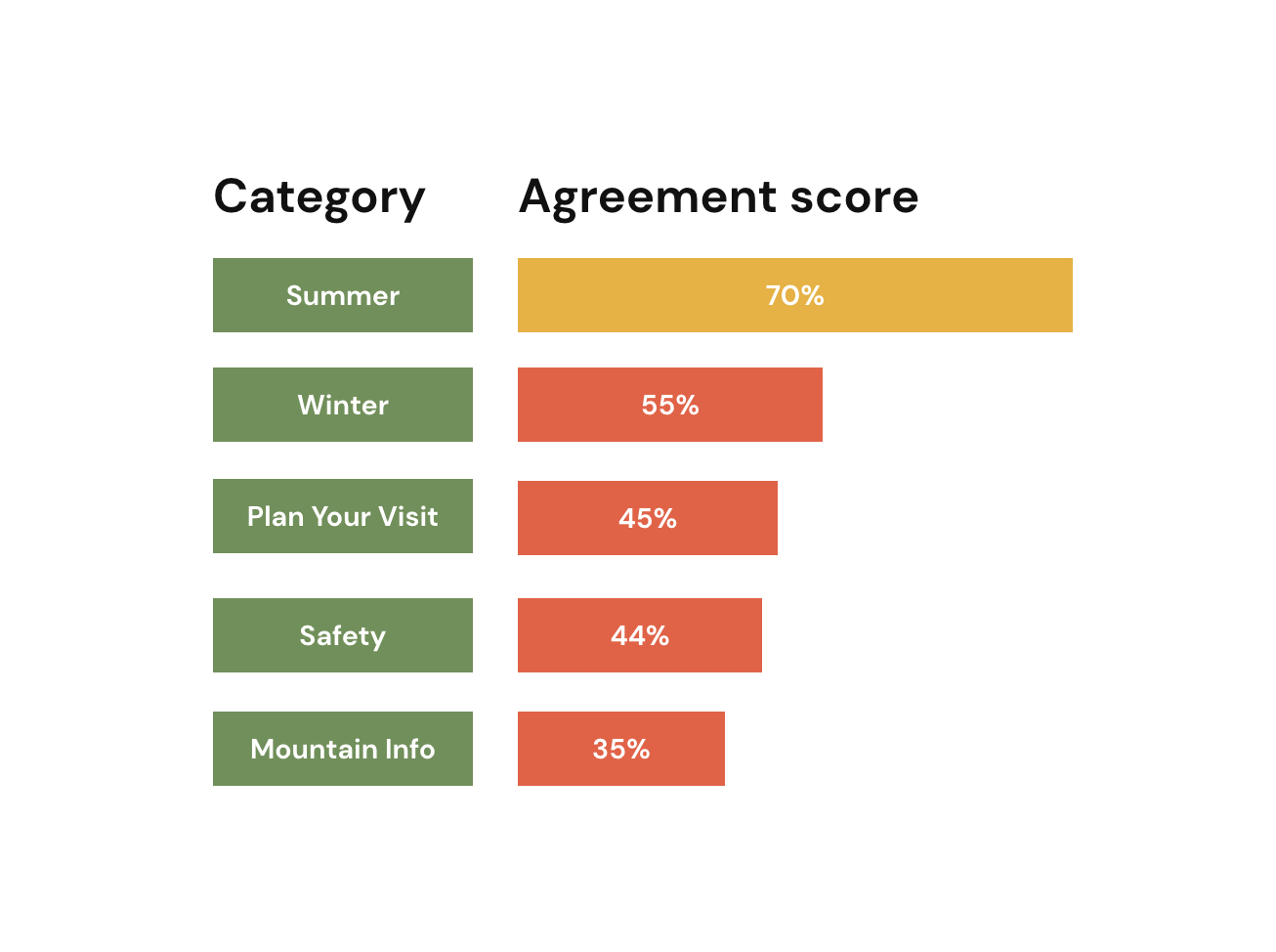
The result is I had very low agreement on each category, indicating there’s major disagreements from participants of the cards that should go into specific categories.
For example, people thought cards like “lift tickets” could have fallen into the “Winter”, “Plan your visit” or “mountain info” category.
Another issue is the unclear cards label. For example, “Scenic Lift Rides” is actually a summer activity at Whitefish, but people thought it’s a winter activity due the name lift rides.

Changes
Those issues I observed indicate the current category is not ideal for people to make correlation with what's nested under. So, I made changes to refine the cards and categories for the next card sort. For the main navigation, I completely reconstructed the original site and categorized them into 4 main areas of information.

Round 2 Card sort Results
12 Participants, 9 cards, 4 categories
The second card sort showed more consistency on how participants categorize cards (columns) into categories (rows). As the results matrix image on the left shown, majority participants categorized “About Us” and “The Whitefish Experience” under category “Discover Whitefish”. “Plan”, “Purchase”, “Conditions & Weather” and “Things To Do” falls into the “Plan Your Visit” category. “Mountain Info” is under category “Explore the Mountain”. “Events” and “Community” are under “See What’s Happening”.
The result is very close to my proposition, with the exception of “Conditions & Weather” and “Things To Do” that participants think these two should fall under the “Plan Your Visit” category.
IA Testing - Treejack tool

IA test result 1&2 :
For the first and second IA tests, using Treejack tool, I tested the participants to see if they can reserve a ski lesson and check current weather conditions. The result was not ideal. I only had a 45% and 40% success rate. After analyzing the results, I think the following reasons were why it scored poorly:
The navigation menu was still too complex and there were too many items. Many testers admitted that they didn’t read all the labels or thought hard on the relations of each label. They glanced at an item and clicked around until they found a close enough answer, just how they would do while browsing a real website.
Labels are unclear to users when it was high level. For example, I have a “Purchase” label as a second level navigation, thinking it would be an obvious choice to purchase a ticket. However, many testers thought it was a gift shop and not where they can purchase lift tickets.
My main level categories were interchangeable for some secondary items. For example, when I asked for current weather conditions on the mountain, most testers went to “See what’s happening” instead of “Explore the mountain”.

Changes
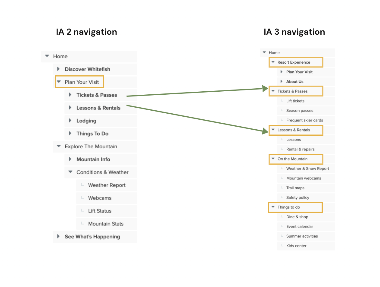
With the first two test results, I realized my original site maps only made sense if you were viewing the main navigation with the second and third navigation at once. That’s why it didn't reflect the problem in the card sort testing. It was challenging for someone that hadn’t viewed the sitemap before to guess each label.
So, I decided to do a revamp by moving the important information such as “Tickets and Passes”, “Lessons & Rentals” and “Things to do” to the main navigation instead of having them nested under the second and third navigation. I also found additional opportunities to remove unnecessary items.

IA Test 3 Result
The result was surprisingly good. I have a 100% success rate. And the post-test interview people told me that they feel it’s very easy to find what they need.
Final Site map

First click test- using Chalkmark
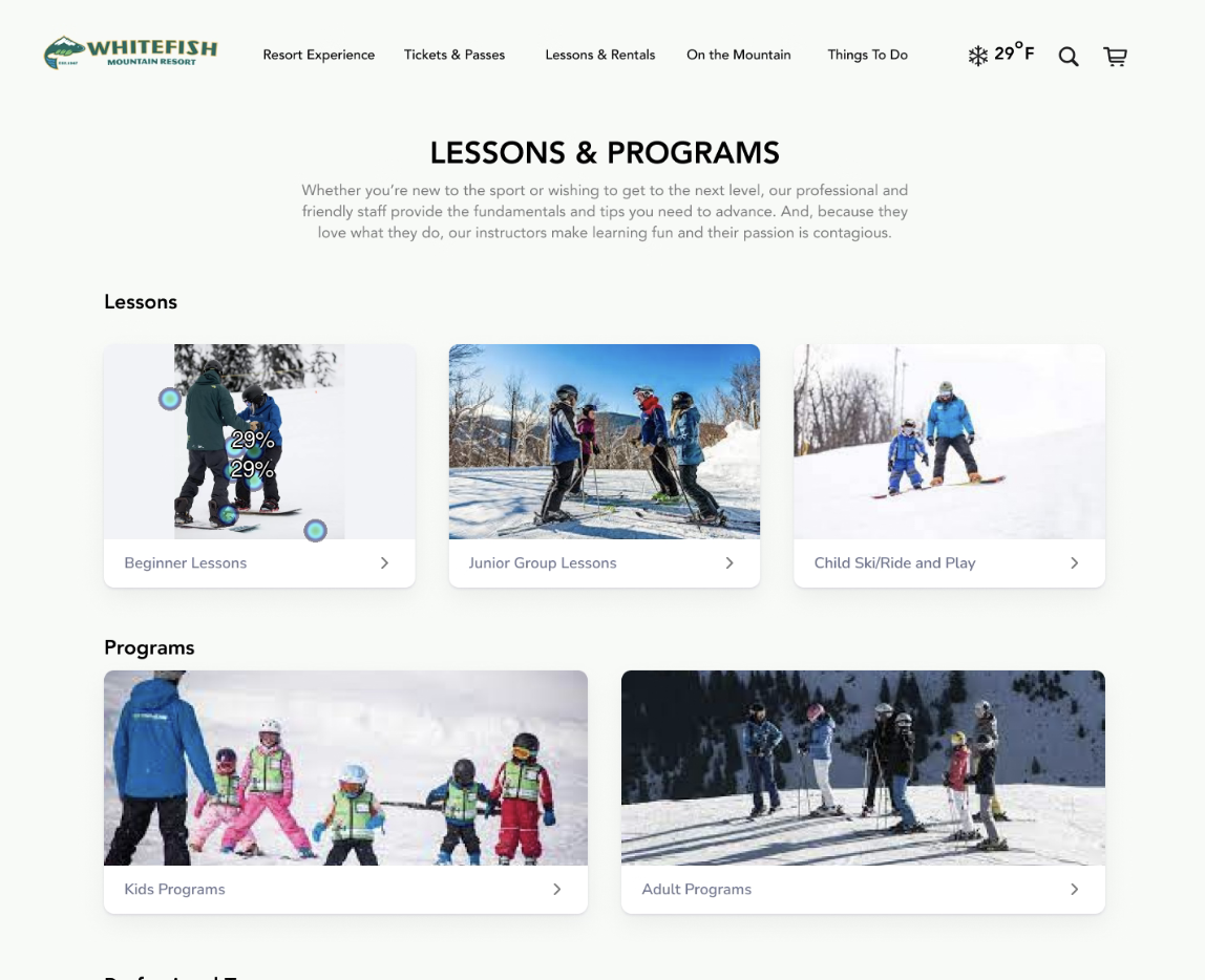
With my new proposed site map, I rapid developed a hi-fi prototype to run first click tests using Chalkmark. This testing can help me understand how people interact with the website when they first land on a page and if they can efficiently complete the task or find the information they are looking for. 7 participants completed the tests.

Key task 1
Find information of ticket price. This task score a 57% success rate with most participants can intuitively use the navigation menu to find the information.

Key task 2
Look for hiking information in Whitefish resort. This task have a 100% success rate. However, users seemed to click on the imagery card that represent hiking instead of using the nav menu.

Key task 3
Find a beginner ski lesson. This task score a 100% success rate as well. However, similar to task 3, users prefer to be drawn to click on the imagery card rather the nav menu.

Key task 4
Find out the mountain weather. This task scored a 71% success rate due to some participants weren’t able to associate “On the Mountain” label with the weather condition. There is room to give the menu label a more semantic meaning.